
Text Input
Widget for reading and writing to a PV.
Basic Properties
- Name (
name) Human-readable name of this widget. Shown in the Outline view.
- PV Name (
pv_name) The name of the main PV for this widget. If set, the widget’s value follows value updates of the corresponding PV.
It is not a requirement to use a PV. You may also control the widget value directly through scripting.
- Style (
style) Type of widget.
Prefer the use of Classic. It leads to better compatibility between different OS platforms.
Code
Value
0
Classic
1
Native
- Widget Type (
widget_type) Readonly property describing the type of this widget.
Behavior Properties
- Actions (
actions) Executable Actions attached to this widget.
- Confirm Message (
confirm_message) The message to be displayed when Show Confirm Dialog is set.
- Enabled (
enabled) Unset to make this control widget unusable.
- Limits from PV (
limits_from_pv) Determine Minimum and Maximum automatically based on the underlying PV.
If the PV is backed by a Yamcs parameter, the mapping is as follows:
Yamcs
Yamcs Studio
WATCH
LO/HI
WARNING
LO/HI
DISTRESS
LO/HI
CRITICAL
LOLO/HIHI
SEVERE
LOLO/HIHI
- Maximum (
maximum) The upper limit of the widget.
- Minimum (
minimum) The lower limit of the widget.
- Multi-line input (
multiline_input) Allow for multiline input.
- Rules (
rules) Rules attached to this widget.
- Scripts (
scripts) Scripts attached to this widget.
- Visible (
visible) Manage the visibility of this widget.
Border Properties
- Alarm Sensitive (
border_alarm_sensitive) If the PV is in alarm state, the widget border and style change to alarm mode.
- Border Color (
border_color) The color of the widget border.
Has no meaning with certain types of border styles (for example, raised borders have a fixed style).
- Border Style (
border_style) The type of border. Some border styles also colorize the background of the widget’s bounding box.
- Border Width (
border_width) The thickness of the widget border.
Has no meaning with certain types of border styles (for example, raised borders have a fixed style).
Display Properties
- Alarm Pulsing (
alarm_pulsing) If enabled, the PV is in alarm state, and the properties BackColor Alarm Sensitive and/or ForeColor Alarm Sensitive are used, then the corresponding colors will fade in and out to draw operator’s attention.
- Auto Size (
auto_size) Adjust the size of the widget to the displayed text.
Note that this can cause unexpected alignment issues when the display is rendered with different fonts.
- BackColor Alarm Sensitive (
backcolor_alarm_sensitive) If the PV is in alarm state, then Background Color matches the corresponding alarm color.
- Background Color (
background_color) The color of the background of the widget’s bounding box. Only visible when the widget uses a border style that fills up the widget area.
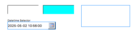
- Datetime Format (
datetime_format) The format of a selected datetime. The format may include the following patterns:
yyyy(year),MM(month),dd(day),HH(hour),mm(minute) andss(seconds).Examples:
yyyy-MM-dd HH:mm:ssMM/dd/yyyy HH:mm:ssMM/dd/yyyy
This property is only visible when Selector Type is set to
Datetime.- File Return Part (
file_return_part) Which part of the selected path should be returned.
This property is only visible when Selector Type is set to
File.Code
Value
0
Full Path
1
Name & Extension
2
Name Only
3
Directory
- File Source (
file_source) What files the selector can choose from.
This property is only visible when Selector Type is set to
File.Code
Value
0
Workspace
1
Local File System
- Font (
font) The font of the label.
- ForeColor Alarm Sensitive (
forecolor_alarm_sensitive) If the PV is in alarm state, then Foreground Color matches the corresponding alarm color.
- Foreground Color (
foreground_color) The color of the label.
- Horizontal Alignment (
horizontal_alignment) Placement of the text within the widget area.
Code
Value
0
Left
1
Center
2
Right
- Rotation Angle (
rotation_angle) Angle in degrees by which to rotate the shape clockwise.
- Selector Type (
selector_type) Use a special type of selector.
Code
Value
0
None
1
File
2
Datetime
- Text (
text) Default text (before a PV value arrives).
- Tooltip (
tooltip) Tooltip when mouse hovers this widget.
- Transparent (
transparent) If true, the unused part of the widget area is left transparent. If false, the unused part uses the Background Color.
Format Properties
- Format Type (
format_type) How to format the PV value.
Code
Value
Description
0
Default
Use a default format type according to the value type.
1
Decimal
2
Exponential
Example:
2.023E103
Hex 32
Example:
0xFDC2054
String
Print a string representation
5
Hex 64
Same as “Hex 32”, but supporting long numbers too. Example:
0xF0DEADBEEF6
Compact
If the value is numeric, use either a Decimal or Exponential format, whichever is the shortest.
7
Engineering
Use engineering notation: exponent of ten is power of a thousand. Example:
20.23E98
Sexagesimal
Format as degrees (or hours), minutes, and seconds with colons inbetween. Example:
12:45:10.29
Sexagesimal HMS
Same as sexagesimal, but the value is assumed to be in radians, and expressed as hours, minutes and seconds.
10
Sexagesimal DMS
Same as sexagesimal, but the value is assumed to be in radians, and expressed as degrees, minutes and seconds.
11
Time String (Unix Millis)
Print Unix Milliseconds as a time string. The format is specified in Preferences > Date Format (default:
yyyy-MM-dd HH:mm:ss.SSS).
- Precision (
precision) Precision in case of Default or Decimal format.
Ignored when Precision from PV is enabled.
- Precision from PV (
precision_from_pv) Get precision information based on the associated PV.
Note
Yamcs does not currently support providing precision information
- Show Low/High (
show_lohi) Show ↓ symbol when the PV exceeds a lower warning or alarm limit, and ↑ symbol when the PV exceeds an upper warning or alarm limit.
- Show Units (
show_units) If the PV is backed by a parameter with unit information, show these units.
Position Properties
- Height (
height) Height of the widget area in pixels.
- Scale Options (
scale_options) If autoscaling is enabled on the Display, then this property allows controlling whether and how this widget participates.
- Width (
width) Width of the widget area in pixels
- X (
x) X-coordinate in pixels of the top-left corner of the widget area.
- Y (
y) Y-coordinate in pixels of the top-left corner of the widget area.