
Radio Box
Widget for writing one of a list of available values to a PV.
Basic Properties
- Name (
name) Human-readable name of this widget. Shown in the Outline view.
- PV Name (
pv_name) The name of the main PV for this widget. If set, the widget’s value follows value updates of the corresponding PV.
It is not a requirement to use a PV. You may also control the widget value directly through scripting.
- Widget Type (
widget_type) Readonly property describing the type of this widget.
Behavior Properties
- Actions (
actions) Executable Actions attached to this widget.
- Enabled (
enabled) Unset to make this control widget unusable.
- Items (
items) The list of available values to choose from.
This property is only available when Items from PV is unset.
- Items from PV (
items_from_pv) If the PV is an enumerated PV, populate the value options based on the list of enumeration states. When selected, each option will write that specific state value to the attached PV.
- Rules (
rules) Rules attached to this widget.
- Scripts (
scripts) Scripts attached to this widget.
- Visible (
visible) Manage the visibility of this widget.
Border Properties
- Alarm Sensitive (
border_alarm_sensitive) If the PV is in alarm state, the widget border and style change to alarm mode.
- Border Color (
border_color) The color of the widget border.
Has no meaning with certain types of border styles (for example, raised borders have a fixed style).
- Border Style (
border_style) The type of border. Some border styles also colorize the background of the widget’s bounding box.
- Border Width (
border_width) The thickness of the widget border.
Has no meaning with certain types of border styles (for example, raised borders have a fixed style).
Display Properties
- Alarm Pulsing (
alarm_pulsing) If enabled, the PV is in alarm state, and the properties BackColor Alarm Sensitive and/or ForeColor Alarm Sensitive are used, then the corresponding colors will fade in and out to draw operator’s attention.
- BackColor Alarm Sensitive (
backcolor_alarm_sensitive) If the PV is in alarm state, then Background Color matches the corresponding alarm color.
- Background Color (
background_color) The color of the background of the widget’s bounding box. Only visible when the widget uses a border style that fills up the widget area.
- Font (
font) The font of the label.
- ForeColor Alarm Sensitive (
forecolor_alarm_sensitive) If the PV is in alarm state, then Foreground Color matches the corresponding alarm color.
- Foreground Color (
foreground_color) The color of the label.
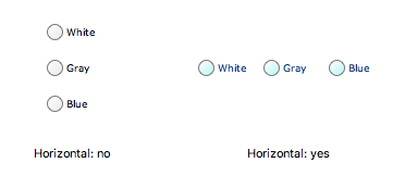
- Horizontal (
horizontal) Direction in which to arrange the items.
- Selected Color (
selected_color) The background color of the selected item.
- Tooltip (
tooltip) Tooltip when mouse hovers this widget.
Position Properties
- Height (
height) Height of the widget area in pixels.
- Scale Options (
scale_options) If autoscaling is enabled on the Display, then this property allows controlling whether and how this widget participates.
- Width (
width) Width of the widget area in pixels
- X (
x) X-coordinate in pixels of the top-left corner of the widget area.
- Y (
y) Y-coordinate in pixels of the top-left corner of the widget area.