
LED
Boolean widget that displays a value as an ON/OFF LED.

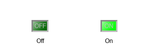
The LED can be made square.
| Property | Value |
|---|---|
Square LED |
yes |
Show Boolean Label |
yes |
Width |
40 |
Height |
30 |
This widget further supports multistate whereby it can assume multiple different color states.
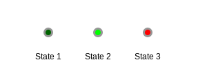
| Property | Value |
|---|---|
State Count |
3 |
3D Effect |
no |
Basic Properties
- Name (
name) Human-readable name of this widget. Shown in the Outline view.
- PV Name (
pv_name) The name of the main PV for this widget. If set, the widget’s value follows value updates of the corresponding PV.
It is not a requirement to use a PV. You may also control the widget value directly through scripting.
- Widget Type (
widget_type) Readonly property describing the type of this widget.
Behavior Properties
- Actions (
actions) Executable Actions attached to this widget.
- Bit (
bit) Matches the widget’s boolean value to a specific bit of the attached PV’s value.
If
-1, any non-zero value is considered true, whereas a zero value is considered false.
- Data Type (
data_type) Control how the widget boolean value is established.
Code
Value
Description
0
Bit
The widget boolean value matches a specific bit (indicated by the Bit property), or the entire value in case the Bit property is set to
-11
Enum
The widget boolean value follows the comparison of its value with specific enumeration states (indicated with the Off State and On State property
- Off State (
off_state) If Data Type is set to
Enum, this indicates the state that matches boolean false.
- On State (
on_state) If Data Type is set to
Enum, this indicates the state that matches boolean true.
- Rules (
rules) Rules attached to this widget.
- Scripts (
scripts) Scripts attached to this widget.
- State Count (
state_count) If set to more than two, this boolean widget becomes a multistate widget, and a number of properties will be added to control each state’s specific options: Color, Label and Value.
The
Bitproperty then has no more meaning. Instead the widget state will be determined by comparing the widget’s numeric value with each state’s Value property.Multistate works with numerical values only. It does not work when the Data Type is set to
Enum.
- Visible (
visible) Manage the visibility of this widget.
Border Properties
- Alarm Sensitive (
border_alarm_sensitive) If the PV is in alarm state, the widget border and style change to alarm mode.
- Border Color (
border_color) The color of the widget border.
Has no meaning with certain types of border styles (for example, raised borders have a fixed style).
- Border Style (
border_style) The type of border. Some border styles also colorize the background of the widget’s bounding box.
- Border Width (
border_width) The thickness of the widget border.
Has no meaning with certain types of border styles (for example, raised borders have a fixed style).
Display Properties
- 3D Effect (
effect_3d) Whether the rendering includes gradient and shadow effects.
- Alarm Pulsing (
alarm_pulsing) If enabled, the PV is in alarm state, and the properties BackColor Alarm Sensitive and/or ForeColor Alarm Sensitive are used, then the corresponding colors will fade in and out to draw operator’s attention.
- BackColor Alarm Sensitive (
backcolor_alarm_sensitive) If the PV is in alarm state, then Background Color matches the corresponding alarm color.
- Background Color (
background_color) The color of the background of the widget’s bounding box. Only visible when the widget uses a border style that fills up the widget area.
- Bulb Border (
bulb_border) The width of the border surrounding the LED bulb.
- Bulb Border Color (
bulb_border_color) The color of the border surrounding the LED bulb.
- Font (
font) The font of the label.
- ForeColor Alarm Sensitive (
forecolor_alarm_sensitive) If the PV is in alarm state, then Foreground Color matches the corresponding alarm color.
- Foreground Color (
foreground_color) The color of the label.
- Off Color (
off_color) Color of the LED when it is off.
- Off Label (
off_label) The label text when this widget’s boolean state is false.
- On Color (
on_color) Color of the LED when it is on.
- On Label (
on_label) The label text when this widget’s boolean state is true.
- Show Boolean Label (
show_boolean_label) Whether the label is visible (controlled with properties Off Label and On Label).
- Square LED (
square_led) Whether the LED shape is round or rectangular.
- Tooltip (
tooltip) Tooltip when mouse hovers this widget.
Position Properties
- Height (
height) Height of the widget area in pixels.
- Scale Options (
scale_options) If autoscaling is enabled on the Display, then this property allows controlling whether and how this widget participates.
- Width (
width) Width of the widget area in pixels
- X (
x) X-coordinate in pixels of the top-left corner of the widget area.
- Y (
y) Y-coordinate in pixels of the top-left corner of the widget area.