
Ellipse
Widget that draws an ellipse shape.
Example of shape fill:
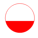
| Property | Value |
|---|---|
Foreground Color |
rgb(255, 0, 0) |
Fill Level |
40.0 |
Horizontal Fill |
no |
Transparent |
yes |
Line Color |
rgb(255, 0, 0) |
Line Width |
1 |
Example of gradient effect:
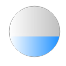
| Property | Value |
|---|---|
Background Color |
rgb(191, 191, 191) |
Fill Level |
40.0 |
Foreground Color |
rgb(30, 144, 255) |
Horizontal Fill |
no |
Gradient |
yes |
Line Color |
rgb(161, 161, 161) |
Line Width |
1 |
The shape background and foreground colors can be made alarm-aware by attaching a PV. Note that the PV value is otherwise ignored. In particular: it does not impact fill level (use a Tank for this use case).
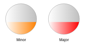
| Property | Value |
|---|---|
ForeColor Alarm Sensitive |
yes |
Basic Properties
- Name (
name) Human-readable name of this widget. Shown in the Outline view.
- PV Name (
pv_name) The name of the main PV for this widget. If set, the widget’s value follows value updates of the corresponding PV.
It is not a requirement to use a PV. You may also control the widget value directly through scripting.
- Widget Type (
widget_type) Readonly property describing the type of this widget.
Behavior Properties
- Actions (
actions) Executable Actions attached to this widget.
- Rules (
rules) Rules attached to this widget.
- Scripts (
scripts) Scripts attached to this widget.
- Visible (
visible) Manage the visibility of this widget.
Border Properties
- Alarm Sensitive (
border_alarm_sensitive) If the PV is in alarm state, the widget border and style change to alarm mode.
- Border Color (
border_color) The color of the widget border.
Has no meaning with certain types of border styles (for example, raised borders have a fixed style).
- Border Style (
border_style) The type of border. Some border styles also colorize the background of the widget’s bounding box.
- Border Width (
border_width) The thickness of the widget border.
Has no meaning with certain types of border styles (for example, raised borders have a fixed style).
Display Properties
- Alarm Pulsing (
alarm_pulsing) If enabled, the PV is in alarm state, and the properties BackColor Alarm Sensitive and/or ForeColor Alarm Sensitive are used, then the corresponding colors will fade in and out to draw operator’s attention.
- Alpha (
alpha) Opacity level of the shape. Should be a value in the range 0 to 255.
- Anti Alias (
anti_alias) Whether anti-aliasing is enabled for drawing the shape.
- BackColor Alarm Sensitive (
backcolor_alarm_sensitive) If the PV is in alarm state, then Background Color matches the corresponding alarm color.
- Background Color (
background_color) The color of the ellipse shape.
- Background Gradient Color (
bg_gradient_color) If the Gradient property is true, and the Transparent property is false, then this indicates the start color of the gradient that is used for the filled part of the shape. The stop color is defined by the property Background Color.
- Fill Level (
fill_level) Percentage of the shape that should be filled with Foreground Color. The remaining part of the shape is filled up with Background Color (unless the Transparent property is enabled).
- Font (
font) The font of the label.
- ForeColor Alarm Sensitive (
forecolor_alarm_sensitive) If the PV is in alarm state, then Foreground Color matches the corresponding alarm color.
- Foreground Color (
foreground_color) The color of the shape fill.
- Foreground Gradient Color (
fg_gradient_color) If the Gradient property is true, then this indicates the start color of the gradient that is used for the filled part of the shape. The stop color is defined by the property Foreground Color.
- Gradient (
gradient) Whether to fill this shape with a gradient.
The gradient for the filled part of this shape are controlled with the properties Foreground Color and Foreground Gradient Color.
The gradient for the non-filled part of this shape are controlled with the properties Background Color and Background Gradient Color (unless the Transparent property is enabled).
The gradient direction is reverse to the direction set by Horizontal Fill.
- Horizontal Fill (
horizontal_fill) If enabled the fill direction is horizontal (left to right). Otherwise vertical (bottom to top).
- Line Color (
line_color) Color of the stroke.
- Line Style (
line_style) The type of stroke.
Code
Value
Description
0
Solid
Uninterrupted
1
Dash
Applies the pattern: 6px solid, 2px gap
2
Dot
Applies the pattern: 2px solid, 2px gap
3
DashDot
Applies the pattern: 6px solid, 2px gap, 2px solid, 2px gap
4
DashDotDot
Applies the pattern: 6px solid, 2px gap, 2px solid, 2px gap, 2px solid, 2px gap
- Line Width (
line_width) Thickness of the shape stroke
- Tooltip (
tooltip) Tooltip when mouse hovers this widget.
- Transparent (
transparent) If true, the unused part of the widget area is left transparent. If false, the unused part uses the Background Color.
Position Properties
- Height (
height) Height of the widget area in pixels.
- Scale Options (
scale_options) If autoscaling is enabled on the Display, then this property allows controlling whether and how this widget participates.
- Width (
width) Width of the widget area in pixels
- X (
x) X-coordinate in pixels of the top-left corner of the widget area.
- Y (
y) Y-coordinate in pixels of the top-left corner of the widget area.