- Overview
- Display Builder
- Display Runner
- Processed Variables
- Widgets
- Action Button
- Arc
- Array
- Boolean Button
- Boolean Switch
- Byte Monitor
- Check Box
- Choice Button
- Combo
- Display
- Ellipse
- Gauge
- Grid Layout
- Grouping Container
- Image
- Image Boolean Button
- Image Boolean Indicator
- Intensity Graph
- Knob
- Label
- LED
- Linking Container
- Menu Button
- Meter
- Polygon
- Polyline
- Progress Bar
- Radio Box
- Rectangle
- Rounded Rectangle
- Sash Container
- Scaled Slider
- Scrollbar
- Spinner
- Tabbed Container
- Table
- Tank
- Text Input
- Text Update
- Thermometer
- Thumb Wheel
- XY Graph
- Web Browser
- Actions
- Borders
- Rules
- Scripts
- Macros
- Tuning
Yamcs Studio Release Notes
Source Code Documentation
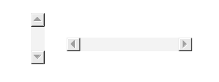
Scrollbar
Widget for writing to a numeric PV.

Basic Properties
- Name (
name) Human-readable name of this widget. Shown in the Outline view.
- PV Name (
pv_name) The name of the main PV for this widget. If set, the widget’s value follows value updates of the corresponding PV.
It is not a requirement to use a PV. You may also control the widget value directly through scripting.
- Widget Type (
widget_type) Readonly property describing the type of this widget.
Behavior Properties
- Actions (
actions) Executable Actions attached to this widget.
- Bar Length (
bar_length) Thumb size, relative to the value range.
- Enabled (
enabled) Unset to make this control widget unusable.
- Limits from PV (
limits_from_pv) Determine Minimum and Maximum automatically based on the underlying PV.
If the PV is backed by a Yamcs parameter, the mapping is as follows:
Yamcs
Yamcs Studio
WATCH
LO/HI
WARNING
LO/HI
DISTRESS
LO/HI
CRITICAL
LOLO/HIHI
SEVERE
LOLO/HIHI
- Maximum (
maximum) The upper limit of the widget.
- Minimum (
minimum) The lower limit of the widget.
- Page Increment (
page_increment) Increment added/subtracted when:
Clicking the scroll track next to the thumb.
Pressing PgUp or PgDn.
- Rules (
rules) Rules attached to this widget.
- Scripts (
scripts) Scripts attached to this widget.
- Step Increment (
step_increment) Increment added/subtracted when:
Clicking the arrow buttons.
Pressing Left or Right (in case of a horizontal bar).
Pressing Up or Down (in case of a vertical bar).
- Visible (
visible) Manage the visibility of this widget.
Border Properties
- Alarm Sensitive (
border_alarm_sensitive) If the PV is in alarm state, the widget border and style change to alarm mode.
- Border Color (
border_color) The color of the widget border.
Has no meaning with certain types of border styles (for example, raised borders have a fixed style).
- Border Style (
border_style) The type of border. Some border styles also colorize the background of the widget’s bounding box.
- Border Width (
border_width) The thickness of the widget border.
Has no meaning with certain types of border styles (for example, raised borders have a fixed style).
Display Properties
- Alarm Pulsing (
alarm_pulsing) If enabled, the PV is in alarm state, and the properties BackColor Alarm Sensitive and/or ForeColor Alarm Sensitive are used, then the corresponding colors will fade in and out to draw operator’s attention.
- BackColor Alarm Sensitive (
backcolor_alarm_sensitive) If the PV is in alarm state, then Background Color matches the corresponding alarm color.
- Background Color (
background_color) The color of the background of the widget’s bounding box. Only visible when the widget uses a border style that fills up the widget area.
- Font (
font) The font of the label.
- ForeColor Alarm Sensitive (
forecolor_alarm_sensitive) If the PV is in alarm state, then Foreground Color matches the corresponding alarm color.
- Foreground Color (
foreground_color) The color of the label.
- Horizontal (
horizontal) Yes for a horizontal bar, otherwise vertical.
- Show Value Tip (
show_value_tip) Display the current value while it is changing.
- Tooltip (
tooltip) Tooltip when mouse hovers this widget.
Position Properties
- Height (
height) Height of the widget area in pixels.
- Scale Options (
scale_options) If autoscaling is enabled on the Display, then this property allows controlling whether and how this widget participates.
- Width (
width) Width of the widget area in pixels
- X (
x) X-coordinate in pixels of the top-left corner of the widget area.
- Y (
y) Y-coordinate in pixels of the top-left corner of the widget area.
