
Image Boolean Indicator
Boolean widget that alternates images based on its value.
Basic Properties
- Name (
name) Human-readable name of this widget. Shown in the Outline view.
- PV Name (
pv_name) The name of the main PV for this widget. If set, the widget’s value follows value updates of the corresponding PV.
It is not a requirement to use a PV. You may also control the widget value directly through scripting.
- Widget Type (
widget_type) Readonly property describing the type of this widget.
Behavior Properties
- Actions (
actions) Executable Actions attached to this widget.
- Bit (
bit) Matches the widget’s boolean value to a specific bit of the attached PV’s value.
If
-1, any non-zero value is considered true, whereas a zero value is considered false.
- Data Type (
data_type) Control how the widget boolean value is established.
Code
Value
Description
0
Bit
The widget boolean value matches a specific bit (indicated by the Bit property), or the entire value in case the Bit property is set to
-11
Enum
The widget boolean value follows the comparison of its value with specific enumeration states (indicated with the Off State and On State property
- Off State (
off_state) If Data Type is set to
Enum, this indicates the state that matches boolean false.
- On State (
on_state) If Data Type is set to
Enum, this indicates the state that matches boolean true.
- Rules (
rules) Rules attached to this widget.
- Scripts (
scripts) Scripts attached to this widget.
- Visible (
visible) Manage the visibility of this widget.
Border Properties
- Alarm Sensitive (
border_alarm_sensitive) If the PV is in alarm state, the widget border and style change to alarm mode.
- Border Color (
border_color) The color of the widget border.
Has no meaning with certain types of border styles (for example, raised borders have a fixed style).
- Border Style (
border_style) The type of border. Some border styles also colorize the background of the widget’s bounding box.
- Border Width (
border_width) The thickness of the widget border.
Has no meaning with certain types of border styles (for example, raised borders have a fixed style).
Display Properties
- Alarm Pulsing (
alarm_pulsing) If enabled, the PV is in alarm state, and the properties BackColor Alarm Sensitive and/or ForeColor Alarm Sensitive are used, then the corresponding colors will fade in and out to draw operator’s attention.
- BackColor Alarm Sensitive (
backcolor_alarm_sensitive) If the PV is in alarm state, then Background Color matches the corresponding alarm color.
- Background Color (
background_color) The color of the background of the widget’s bounding box. Only visible when the widget uses a border style that fills up the widget area.
- Boolean Label Position (
boolean_label_position) Where to position the label within the widget area (top, bottom, left, right, top-left, top-right, bottom-left, bottom-right).
Code
Value
0
Default
1
Top
2
Left
3
Center
4
Right
5
Bottom
6
Top Left
7
Top Right
8
Bottom Left
9
Bottom Right
- Font (
font) The font of the label.
- ForeColor Alarm Sensitive (
forecolor_alarm_sensitive) If the PV is in alarm state, then Foreground Color matches the corresponding alarm color.
- Foreground Color (
foreground_color) The color of the label.
- On Label (
on_label) The label text when this widget’s boolean state is true.
- Show Boolean Label (
show_boolean_label) Whether the label is visible (controlled with properties Off Label and On Label).
- Tooltip (
tooltip) Tooltip when mouse hovers this widget.
- Transparent (
transparency) Support transparent parts of the drawn image. If false, these parts are filled with the widget Background Color instead.
Image Properties
- Animation Aligned to Nearest Second (
align_to_nearest_second) In case the image is an animated GIF, then start the animation only upon the next second.
- Auto Size (
auto_size) Adjust the size of the widget to the image size. Has no effect when Stretch to Fit is enabled.
- No Animation (
no_animation) In case the image is an animated GIF, control whether it shows animated or not.
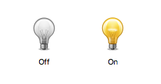
- Off Image (
off_image) The image when this widget’s boolean state is false.
- On Image (
on_image) The image when this widget’s boolean state is true.
- Stretch to Fit (
stretch_to_fit) Adjust the size of the image to the widget size.
Position Properties
- Height (
height) Height of the widget area in pixels.
- Scale Options (
scale_options) If autoscaling is enabled on the Display, then this property allows controlling whether and how this widget participates.
- Width (
width) Width of the widget area in pixels
- X (
x) X-coordinate in pixels of the top-left corner of the widget area.
- Y (
y) Y-coordinate in pixels of the top-left corner of the widget area.