
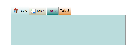
Tabbed Container
Container widget for grouping widgets in a number of tabs. X and Y coordinates of contained widgets are relative to the top-left of the container.
While editing in Yamcs Studio, tabs can be organized via the right-click context menu.
Basic Properties
- Macros (
macros) Macros available within this container.
- Name (
name) Human-readable name of this widget. Shown in the Outline view.
- Widget Type (
widget_type) Readonly property describing the type of this widget.
Behavior Properties
- Actions (
actions) Executable Actions attached to this widget.
- Enabled (
enabled) Unset to make contained control widgets unusable.
- Rules (
rules) Rules attached to this widget.
- Scripts (
scripts) Scripts attached to this widget.
- Tab Count (
tab_count) The number of tabs.
- Visible (
visible) Manage the visibility of this widget.
Border Properties
- Border Color (
border_color) The color of the widget border.
Has no meaning with certain types of border styles (for example, raised borders have a fixed style).
- Border Style (
border_style) The type of border. Some border styles also colorize the background of the widget’s bounding box.
- Border Width (
border_width) The thickness of the widget border.
Has no meaning with certain types of border styles (for example, raised borders have a fixed style).
Display Properties
- Active Tab (
active_tab) The tab that is visible.
- Background Color (
background_color) The color of the background of the widget’s bounding box. Only visible when the widget uses a border style that fills up the widget area.
- Foreground Color (
foreground_color) The color of the label.
- Horizontal Tabs (
horizontal_tabs) If yes, tabs are organised horizontally (at the top of the widget area).
If no, tabs are organised vertically (at the left of the widget area).
- Minimum Tab Height (
minimum_tab_height) The minimum height in pixels of tabs.
- Tooltip (
tooltip) Tooltip when mouse hovers this widget.
- Transparent (
transparent) Make the container background transparent.
Position Properties
- Height (
height) Height of the widget area in pixels.
- Scale Options (
scale_options) If autoscaling is enabled on the Display, then this property allows controlling whether and how this widget participates.
- Width (
width) Width of the widget area in pixels
- X (
x) X-coordinate in pixels of the top-left corner of the widget area.
- Y (
y) Y-coordinate in pixels of the top-left corner of the widget area.
Tab-specific Properties
The property names for the following properties take the form tab_x_property_name,
where x is the zero-based index of that tab.
- Background Color (
tab_x_background_color) The color of the background of the tab’s bounding box.
- Enabled (
tab_x_enabled) Unset to make a tab unselectable, and make its contained control widgets unusable.
- Font (
tab_x_font) Font used for the tab title.
- Foreground Color (
tab_x_foreground_color) The text color used for the tab title.
- Icon Path (
tab_x_icon_path) Path to an image that is used as an icon next to the tab title.
- Title (
tab_x_title) The title of the tab.
Additional API
Tabbed Container widgets expose the following additional Widget API for use in scripting:
- getActiveTabIndex()
Get the index of the active tab.
- setActiveTabIndex( index )
Activate a specific tab.