
Polygon
Widget that draws a polygon shape.
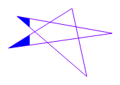
To draw a polygon, choose the tool from the Palette, and click on the start location. Every next click will add a new point. Double-click to indicate this is the last point. The last point is connected to the first point to form a closed shape. Points can be repositioned using the yellow handles.
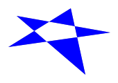
Example of shape fill:
| Property | Value |
|---|---|
Fill Level |
20.0 |
Horizontal Fill |
yes |
Transparent |
yes |
Line Width |
1 |
The shape background and foreground colors can be made alarm-aware by attaching a PV. Note that the PV value is otherwise ignored.
| Property | Value |
|---|---|
ForeColor Alarm Sensitive |
yes |
Basic Properties
- Name (
name) Human-readable name of this widget. Shown in the Outline view.
- PV Name (
pv_name) The name of the main PV for this widget. If set, the widget’s value follows value updates of the corresponding PV.
It is not a requirement to use a PV. You may also control the widget value directly through scripting.
- Widget Type (
widget_type) Readonly property describing the type of this widget.
Behavior Properties
- Actions (
actions) Executable Actions attached to this widget.
- Rules (
rules) Rules attached to this widget.
- Scripts (
scripts) Scripts attached to this widget.
- Visible (
visible) Manage the visibility of this widget.
Border Properties
- Alarm Sensitive (
border_alarm_sensitive) If the PV is in alarm state, the widget border and style change to alarm mode.
- Border Color (
border_color) The color of the widget border.
Has no meaning with certain types of border styles (for example, raised borders have a fixed style).
- Border Style (
border_style) The type of border. Some border styles also colorize the background of the widget’s bounding box.
- Border Width (
border_width) The thickness of the widget border.
Has no meaning with certain types of border styles (for example, raised borders have a fixed style).
Display Properties
- Alarm Pulsing (
alarm_pulsing) If enabled, the PV is in alarm state, and the properties BackColor Alarm Sensitive and/or ForeColor Alarm Sensitive are used, then the corresponding colors will fade in and out to draw operator’s attention.
- Alpha (
alpha) Opacity level of the shape. Should be a value in the range 0 to 255.
- Anti Alias (
anti_alias) Whether anti-aliasing is enabled for drawing the shape.
- BackColor Alarm Sensitive (
backcolor_alarm_sensitive) If the PV is in alarm state, then Background Color matches the corresponding alarm color.
- Background Color (
background_color) The color of the polygon shape.
- Fill Level (
fill_level) Percentage of the shape that should be filled with Foreground Color. The remaining part of the shape is filled up with Background Color (unless the Transparent property is enabled).
- Font (
font) The font of the label.
- ForeColor Alarm Sensitive (
forecolor_alarm_sensitive) If the PV is in alarm state, then Foreground Color matches the corresponding alarm color.
- Foreground Color (
foreground_color) The color of the shape fill.
- Horizontal Fill (
horizontal_fill) If enabled the fill direction is horizontal (left to right). Otherwise vertical (bottom to top).
- Line Color (
line_color) Color of the stroke.
- Line Style (
line_style) The type of stroke.
Code
Value
Description
0
Solid
Uninterrupted
1
Dash
Applies the pattern: 6px solid, 2px gap
2
Dot
Applies the pattern: 2px solid, 2px gap
3
DashDot
Applies the pattern: 6px solid, 2px gap, 2px solid, 2px gap
4
DashDotDot
Applies the pattern: 6px solid, 2px gap, 2px solid, 2px gap, 2px solid, 2px gap
- Line Width (
line_width) Thickness of the shape stroke
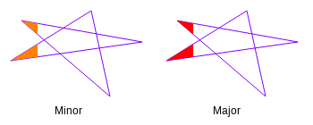
- Points (
points) The point array that describes the shape of this widget.
- Rotation Angle (
rotation_angle) Angle in degrees by which to rotate the shape clockwise.
- Tooltip (
tooltip) Tooltip when mouse hovers this widget.
- Transparent (
transparent) If true, the unused part of the widget area is left transparent. If false, the unused part uses the Background Color.
Position Properties
- Height (
height) Height of the widget area in pixels.
- Scale Options (
scale_options) If autoscaling is enabled on the Display, then this property allows controlling whether and how this widget participates.
- Width (
width) Width of the widget area in pixels
- X (
x) X-coordinate in pixels of the top-left corner of the widget area.
- Y (
y) Y-coordinate in pixels of the top-left corner of the widget area.