
Sash Container
Container widget for grouping widgets in two panels. X and Y coordinates of contained widgets are relative to the top-left of the specific sash panel they belong to.
The panels can be oriented left/right or top/bottom. The available container space can be redistributed at runtime by dragging the sash.
Basic Properties
- Macros (
macros) Macros available within this container.
- Name (
name) Human-readable name of this widget. Shown in the Outline view.
- Widget Type (
widget_type) Readonly property describing the type of this widget.
Behavior Properties
- Actions (
actions) Executable Actions attached to this widget.
- Enabled (
enabled) Unset to make contained control widgets unusable.
- Rules (
rules) Rules attached to this widget.
- Scripts (
scripts) Scripts attached to this widget.
- Visible (
visible) Manage the visibility of this widget.
Border Properties
- Border Color (
border_color) The color of the widget border.
Has no meaning with certain types of border styles (for example, raised borders have a fixed style).
- Border Style (
border_style) The type of border. Some border styles also colorize the background of the widget’s bounding box.
- Border Width (
border_width) The thickness of the widget border.
Has no meaning with certain types of border styles (for example, raised borders have a fixed style).
Display Properties
- Background Color (
background_color) The color of the background of the widget’s bounding box. Only visible when the widget uses a border style that fills up the widget area.
- Font (
font) The font of the label.
- Foreground Color (
foreground_color) The color of the label.
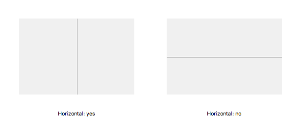
- Horizontal (
horizontal) If yes, the sash uses a left and a right panel. Otherwise the sash uses a top panel and a bottom panel.
- Sash Position (
sash_position) Initial position of the sash (value between 0 and 1).
- Sash Style (
sash_style) Select the style of the sash:
Code
Value
0
None
1
Rounded
2
Ridged
3
Etched
4
Line
5
Double Lines
- Sash Width (
sash_width) Width in pixels of the sash. A minimum width of 1 is enforced.
- Tooltip (
tooltip) Tooltip when mouse hovers this widget.
- Transparent (
transparent) Make the container background transparent.
Panel 1 (Left/Up) Properties
- Auto Scale Children (
panel1_auto_scale_children) If yes, the contained widgets are auto scaled while the sash divider is being moved. This auto scaling respects the Scale Options set by each widget.
If no, contained widgets keep their size, and a scrollbar is added to the sash panel when necessary.
Panel 2 (Right/Down) Properties
- Auto Scale Children (
panel2_auto_scale_children) If yes, the contained widgets are auto scaled while the sash divider is being moved. This auto scaling respects the Scale Options set by each widget.
If no, contained widgets keep their size, and a scrollbar is added to the sash panel when necessary.
Position Properties
- Height (
height) Height of the widget area in pixels.
- Scale Options (
scale_options) If autoscaling is enabled on the Display, then this property allows controlling whether and how this widget participates.
- Width (
width) Width of the widget area in pixels
- X (
x) X-coordinate in pixels of the top-left corner of the widget area.
- Y (
y) Y-coordinate in pixels of the top-left corner of the widget area.