
Check Box
Widget for writing 0 or 1 to the attached PV. This widget can also be used to flip a single bit of the attached PV.
Basic Properties
- Name (
name) Human-readable name of this widget. Shown in the Outline view.
- PV Name (
pv_name) The name of the main PV for this widget. If set, the widget’s value follows value updates of the corresponding PV.
It is not a requirement to use a PV. You may also control the widget value directly through scripting.
- Widget Type (
widget_type) Readonly property describing the type of this widget.
Behavior Properties
- Actions (
actions) Executable Actions attached to this widget.
- Bit (
bit) Matches the widget’s boolean value to a specific bit of the attached PV’s value.
If
-1, any non-zero value is considered true, whereas a zero value is considered false.This widget writes the numeric values 0 (unselected) or 1 (selected) to the PV.
- Enabled (
enabled) Unset to make this control widget unusable.
- Rules (
rules) Rules attached to this widget.
- Scripts (
scripts) Scripts attached to this widget.
- Visible (
visible) Manage the visibility of this widget.
Border Properties
- Alarm Sensitive (
border_alarm_sensitive) If the PV is in alarm state, the widget border and style change to alarm mode.
- Border Color (
border_color) The color of the widget border.
Has no meaning with certain types of border styles (for example, raised borders have a fixed style).
- Border Style (
border_style) The type of border. Some border styles also colorize the background of the widget’s bounding box.
- Border Width (
border_width) The thickness of the widget border.
Has no meaning with certain types of border styles (for example, raised borders have a fixed style).
Display Properties
- Alarm Pulsing (
alarm_pulsing) If enabled, the PV is in alarm state, and the properties BackColor Alarm Sensitive and/or ForeColor Alarm Sensitive are used, then the corresponding colors will fade in and out to draw operator’s attention.
- Auto Size (
auto_size) Adjust the size of the widget to the displayed text.
Note that this can cause unexpected alignment issues when the display is rendered with different fonts.
- BackColor Alarm Sensitive (
backcolor_alarm_sensitive) If the PV is in alarm state, then Background Color matches the corresponding alarm color.
- Background Color (
background_color) The color of the background of the widget’s bounding box. Only visible when the widget uses a border style that fills up the widget area.
- Font (
font) The font of the label.
- ForeColor Alarm Sensitive (
forecolor_alarm_sensitive) If the PV is in alarm state, then Foreground Color matches the corresponding alarm color.
- Foreground Color (
foreground_color) The color of the label.
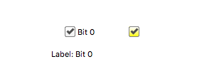
- Label (
label) The displayed text.
- Selected Color (
selected_color) The color of the check mark.
- Tooltip (
tooltip) Tooltip when mouse hovers this widget.
Position Properties
- Height (
height) Height of the widget area in pixels.
- Scale Options (
scale_options) If autoscaling is enabled on the Display, then this property allows controlling whether and how this widget participates.
- Width (
width) Width of the widget area in pixels
- X (
x) X-coordinate in pixels of the top-left corner of the widget area.
- Y (
y) Y-coordinate in pixels of the top-left corner of the widget area.