
Label
Widget that draws a text label.
Labels can be edited in-place by pressing F2 on them.
Basic Properties
- Name (
name) Human-readable name of this widget. Shown in the Outline view.
- Widget Type (
widget_type) Readonly property describing the type of this widget.
Behavior Properties
- Actions (
actions) Executable Actions attached to this widget.
- Rules (
rules) Rules attached to this widget.
- Scripts (
scripts) Scripts attached to this widget.
- Visible (
visible) Manage the visibility of this widget.
- Show Scrollbar (
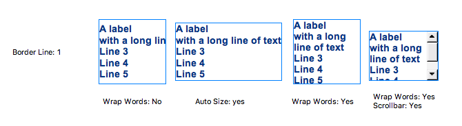
show_scrollbar) Show scrollbars when the text overflows the bounding box of this widget.
This property is only visible when Wrap Words is set.
- Wrap Words (
wrap_words) Break lines when they exceed the widget area.
Border Properties
- Border Color (
border_color) The color of the widget border.
Has no meaning with certain types of border styles (for example, raised borders have a fixed style).
- Border Style (
border_style) The type of border. Some border styles also colorize the background of the widget’s bounding box.
- Border Width (
border_width) The thickness of the widget border.
Has no meaning with certain types of border styles (for example, raised borders have a fixed style).
Display Properties
- Auto Size (
auto_size) Adjust the size of the widget to the displayed text.
Note that this can cause unexpected alignment issues when the display is rendered with different fonts.
- Background Color (
background_color) The color of the background of the widget’s bounding box. Only visible when the widget uses a border style that fills up the widget area.
- Font (
font) The font of the label.
- Foreground Color (
foreground_color) The color of the label.
- Horizontal Alignment (
horizontal_alignment) Placement of the text within the widget area.
Code
Value
0
Left
1
Center
2
Right
- Text (
text) The displayed text.
- Tooltip (
tooltip) Tooltip when mouse hovers this widget.
- Transparent (
transparent) If true, the unused part of the widget area is left transparent. If false, the unused part uses the Background Color.
- Vertical Alignment (
vertical_alignment) Placement of the text within the widget area.
Code
Value
0
Top
1
Middle
2
Bottom
Position Properties
- Height (
height) Height of the widget area in pixels.
- Scale Options (
scale_options) If autoscaling is enabled on the Display, then this property allows controlling whether and how this widget participates.
- Width (
width) Width of the widget area in pixels
- X (
x) X-coordinate in pixels of the top-left corner of the widget area.
- Y (
y) Y-coordinate in pixels of the top-left corner of the widget area.